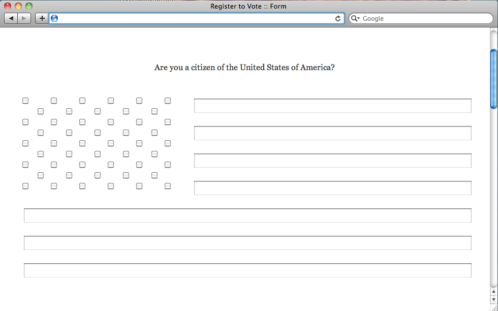
The premise for this project was to create “instruction sets for strangers.” The details of how we accomplish this, the subject matter we address, and our target audience was left open to interpretation.
During my initial research for this project I read an article in the New York Times about the recent changes to voter registration laws that have passed in many states throughout the U.S. New requirements for voter identification, absentee voting, and restrictions on citizen-lead voter registration drives will undoubtedly play an important role in the outcome of the 2012 presidential election. I thought that this “instruction sets for strangers” project would be a good opportunity to try and help “get out the vote” and attempt to combat the drop in voter registration that these new laws will likely cause.
Initially, I thought the most helpful way to empower potential voters would be to create a website that consolidated all of the information on the new laws and provide links to websites that provided online voter registration. I quickly learned that a project of this scale was more than I could accomplish as one person, in a few short weeks. Furthermore, although I was fired up about my cause, the actual execution of the website design and development was a pretty banal exercise for me.
I decided to go in an entirely different direction for my site. Rather than attempt a heroic salvation of the voter registration process, I chose to comment on the poorly-designed user experiences of many existing voter registration websites, as well as the negative experience of navigating the voter registration process as a whole.
Inspired by the work of Alexei Shulgin, I created a frustrating, non-functional website that uses only plain text and form elements. I used JQuery to play tricks on the user and make interactive elements counter-intuitive.
Even though I was pleased with the experimental website I had created, I felt the need to clarify my motivations. To do this, I designed a second, more traditional web page that calls attention to the number of clicks it takes find information on the voter registration sites people turn to first.


