For this assignment, we were asked to redesign the cover art for two different albums.
My approach to the Cut Copy album was to try and visualize the electronic, upbeat sound of their music. I used color, line, and a slight gradient to evoke the lyrics from a popular song on that album–”Lights and Music.”
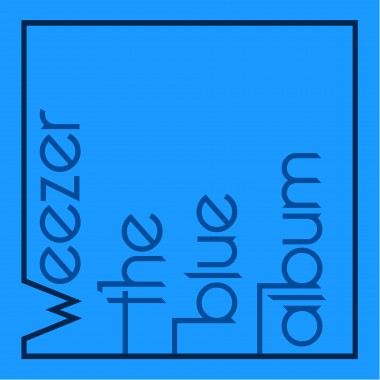
For the Weezer album, I wanted to honor the usual format of their cover art: a photograph of the four band members standing against a plain colored background.
My variation uses typography to stand in for their bodies, one word per band member.
I also incorporated their “W” symbol into the the design of the band name.


